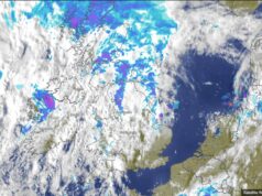
Followers will have seen the GEFS graph before. The top part of the graph is the temperature at 850hpa that 1,500 metres. The thick black line is the 30 year average. The bottom of the graph is precipitation the taller the spikes the greater amount of rain is expected. Each thin coloured line is a member of the GEFS.
So you can see the temperatures will remain mainly below the 30 year average with just the odd warmer day. Showery condition will continue with some very wet days too.
So this, cooler, wetter July weather looks like continuing for the rest of this month and into the 1st week of August. This should be of of no surprise if you read my 30 day outlook that I published on Friday when I used the ECMWF model.